Below are the slides from a presentation I am giving today at Colorado Association of School Executives annual conference in Breckenridge, CO. My goal is to get the point across that we don't need more assessments until we are effective at using the data we do have. The point is not that additional assessments aren't needed to better diagnose and progress monitor, but rather that we need to get past the idea that data in and of themselves will change instruction. Data only talk back if you listening and learning to listen is a process. The point to the executives (administrators) at this conference is that we need to make it easy for our teachers to listen. Check out the slides:
Thursday, August 02, 2007
Balanced Scorecard Metrics
Adams County School District 14 is working to develop a Balanced Scorecard that measures all perspectives (Financial, Learning and Growth, Internal Processes, and Customer/Student Achievement). We have created a strategy map (see the PowerPoint slide below) and a mock-up of our BSC (see the excel below). We are still finalizing the metrics and how they will appear on the scorecard. Our next steps are as follows: (1) include draft data (you will see the draft does not have data yet), (2) test the value of the card with data, (3) determine effective ways to measure objectives that do not yet have metrics. We are open to input.
In our development of the BSC, which is as much a framework for our strategy as it is a reporting tool, we first developed the strategy map. The strategy map frames the interrelationship between perspectives and objectives. In addition, the strategy map is communicating what is important to the district. What becomes problematic is that everything that is important is not easily measurable. For example, one of the things that we have identified as important is to "improve student products." We think this is important because in the 21st Century it is not enough for students to complete the requirements of the traditional school system (e.g. worksheets). Students need to be demonstrating their skills at 21st Century skills like presenting, analyzing, and communicating to and with the wider global community. That said, we haven't the slightest idea how we are going to measure the improvement in student products. What is key is that we still put the objective on the BSC. Even if we haven't figured it out we send the message that this or will be important to the district achieving its mission.
In our development of the BSC, which is as much a framework for our strategy as it is a reporting tool, we first developed the strategy map. The strategy map frames the interrelationship between perspectives and objectives. In addition, the strategy map is communicating what is important to the district. What becomes problematic is that everything that is important is not easily measurable. For example, one of the things that we have identified as important is to "improve student products." We think this is important because in the 21st Century it is not enough for students to complete the requirements of the traditional school system (e.g. worksheets). Students need to be demonstrating their skills at 21st Century skills like presenting, analyzing, and communicating to and with the wider global community. That said, we haven't the slightest idea how we are going to measure the improvement in student products. What is key is that we still put the objective on the BSC. Even if we haven't figured it out we send the message that this or will be important to the district achieving its mission.
Wednesday, June 20, 2007
Building a Balanced Scorecard in K-12

The Balanced Scorecard is a method for measuring progress towards systemic strategic objectives. The BSC was created by two Harvard B-School Professors that argued that businesses spent too much energy focusing on a large number of metrics only related to the bottom line. Many companies, they argued, did not measure customer satisfaction, operational efficiency, or the preparedness of their employees to address their strategic objectives. Kaplan and Norton argued that companies needed to understand the relationship between well-trained employees, operational efficiency, happy customers, and meeting financial targets. The BSC is the resulting framework.
The BSC includes measurable objectives related to staff development, operations, customers, and finances (profit). The BSC is then used to continuously tracked the performance of your organization in achieving these objectives. The BSC has helped many businesses better understand their progress. In fact, half of the Fortune 500 use the BSC.
Public schools are frequently wary of adopting methods from the business sector and the BSC is no exception. However, as a framework it makes perfect sense and is easily adaptable. Move finance to the bottom of the hierarchy and it makes sense. Customers (students) become the focus of the organization rather than Financial. The stream of questions is as follows: How do we manage budgets to ensure that we can provide great professional development? What do we do in professional development to ensure great teaching? What does great teaching look like to guarantee students (customers) thrive in our system?
Adams 14 is working hard to create own BSC now for the educational division.
Here are some school districts that use the BSC:
Tuesday, March 20, 2007
Measuring What Matters Part II
A new report will be released in California regarding the state of education. The report, prepared by 30 "experts" in the field, cites difficulties in sharing data, too many regulations and requirements for leaders, and ineffective methods for identifying effective teachers.
In a previous post I argued that we should be working to "measure what matters". In other words, if we want to know whether a teacher is effective we need to develop an example of "effective" and tools for determining whether the teacher is achieving that example. Teachers and leaders need to know where teachers on a scale (or rubric) and they need to know what to do next to improve. Years of service apparently can differentiate a 1st year teacher from a 5th year teacher, but after that there is little difference between a 5th year teacher and a 15th year teacher. Instead of seeing our longest serving teachers as the most skilled, we should create measures to see our most skilled teachers as our most skilled teachers.
In a previous post I argued that we should be working to "measure what matters". In other words, if we want to know whether a teacher is effective we need to develop an example of "effective" and tools for determining whether the teacher is achieving that example. Teachers and leaders need to know where teachers on a scale (or rubric) and they need to know what to do next to improve. Years of service apparently can differentiate a 1st year teacher from a 5th year teacher, but after that there is little difference between a 5th year teacher and a 15th year teacher. Instead of seeing our longest serving teachers as the most skilled, we should create measures to see our most skilled teachers as our most skilled teachers.
Monday, March 19, 2007
Many Eyes is Addictive Data Visualizing Tool (it's social too)
Many Eyes, a product of the IBM Visual Communication Lab, is a wicked cool tool for seeing all kinds of data in a new way. Many Eyes says their goal is "to "democratize" visualization and to enable a new social kind of data analysis". In practice this means that all data uploaded to this site are public and all visualizations are public and can be commented on (like a blog).
Many Eyes is user-friendly and addictive. I kept loading new forms of data to try different views. I loaded school district demographics over time, speeches made by Margaret Spellings, and rap lyrics from Ice Cube and TuPac.
Imagine the potential in a K-12 setting where students could be challenged to collect data (primary collection or secondary) and then these data would be shared across the world. their classmates could comment, but so too could an expert in the field they are studying. This tool not only creates opportunities to see the world in a new way (literally), but also to collaborate and understand the world more deeply (or see it in a new way metaphorically).
Check out these examples I created:
Example #1: District demographics over time. Click the image here and drill-down (using the plus signs) to the demographics by school, ethnicity, and gender.


Example #2: A tree map of two years of demographic data reveals change in color. Check out the hover over Ajax features.


Many Eyes is user-friendly and addictive. I kept loading new forms of data to try different views. I loaded school district demographics over time, speeches made by Margaret Spellings, and rap lyrics from Ice Cube and TuPac.
Imagine the potential in a K-12 setting where students could be challenged to collect data (primary collection or secondary) and then these data would be shared across the world. their classmates could comment, but so too could an expert in the field they are studying. This tool not only creates opportunities to see the world in a new way (literally), but also to collaborate and understand the world more deeply (or see it in a new way metaphorically).
Check out these examples I created:
Example #1: District demographics over time. Click the image here and drill-down (using the plus signs) to the demographics by school, ethnicity, and gender.
Example #2: A tree map of two years of demographic data reveals change in color. Check out the hover over Ajax features.
Example #3: Tag Cloud of recent testimony from Secretary of Education Margaret Spellings. Any idea what Spellings intends to focus on? Could you imagine students using this to compare the language in two poems, rap lyrics, books on the same subject in two different decades, speeches...or anything else? Imagine how engaged students would be to see the text they are analyzing come alive.
Wednesday, March 07, 2007
Great Design Works for Data Display Too
Excellent post over at Bokardo called Five Principles to Design By. In this post Joshua Porter identifies Five Principles that social web designers should keep in mind and these are easily extended to any school district or architecture designer that is thinking about data display.
First, technology serves humans. If the technology fails or the user cannot figure out how to get value from it, then the design is the problem. A simple concept that seems to be overlooked when considering how to display data to teachers. Second, design is not art. Art is to be enjoyed and design facilitates use. Third, designers do not create experiences, they create artifacts to experience. This seems to be akin to Kathy Sierra’s argument that serving our customers means that in the end it is about them kicking ass. Fourth, great design is invisible because it solves a problem and works well. We take it for granted. Fifth, simplicity is the ultimate sophistication. Distill the design to the absolute needs to solve the problem at hand, that is all.
This all applies directly to design of data systems for school districts to use. If the ultimate goal is for teachers to use the data system to analyze data and track student progress, then the design of the system must be teacher-friendly, focused on their experience, and simple enough that the user does not have to read the freakin’ manual.
Monday, February 12, 2007
Make A Film For Your Parents

Given the imprecise nature of the language we use to communicate with parents regarding their student's performance, I suggested five steps that schools or teachers can take to improve communication. However, I keep playing this issue over in my head and constantly wonder if there is a better way.
What if we were delivering the results as if we were telling a story or making a movie? Twice a week I work with elementary school students in a film club. We work with these students to transform their ideas in to a story (see the district film festival website here). In film, we use a method called storyboarding to visualize what we want to happen. In a sense teachers or schools could think through this very same process with each student for each step: (1) What is the test, when did your son/daughter take the test, and why the results are important? (2) How your student scored some comparison data (e.g. how did the rest of the state, district, or school score)? (3) How you can support your student to improve or maintain high performance? (4) When the student will test next? (5) What is the best way to contact their teacher to get more information?
Above was my picture for the first scene in the storyboard. Here is my storyboard for the first two images. The metaphor of a storyboard is great because it makes you think through the emotion and imagery that you want to create, just like a great director does with a movie. The storyboard version of talking to parents about students could result in better metaphors and descriptions of the student's actual performance. It is a deliberate method for creating a vision for the parents.
Tuesday, February 06, 2007
Mime the Results

The way you present data should slef-explanatory enough that a mime could walk most people through the reports.
At a keynote address I attended last Thursday Tom Guskey said, "If parents don't understand what we are trying to tell them it is our problem, not their problem." Tom Guskey went on to demonstrate that even when we think we are sending a straight-forward message to parents (e.g. end of term grades) there is hidden meaning and unintended messages. Guskey pointed out that grades frequently are inconsistent and include multiple dimensions (e.g. homework, attendance, participation, test perfromance). So a student who knows and understands the content could easily earn a C if they refuse to do home work. A couple of years ago we compared ACT and CSAP performance with student grades within relevant subjects. Guskey said this relationship was weak, but we found no relationship at all (for you stat nerds I believe the correlation was around 0.04). This study led to a re-examination of grading procedures and relationship to the standards.
No matter what assessment or performance related material we are sending home to parents we should be sure that we are clear about the following things: (1) What is the test, when did your son/daughter take the test, and why the results are important. (2) How your student scored some comparison data (e.g. how did the rest of the state, district, or school score). (3) How you can support your student to improve or maintain high performance. (4) When the student will test next. (5) What is the best way to contact their teacher to get more information.
How often are we successful at all of these steps?
Monday, February 05, 2007
Digital Divide

The United States ranks 21st in Digital Opportunity Index according to the International Telecommunications Union. The index is a gross measure of the digital divide. Korea ranks number one and Japan, which ranks number two accounts for 80% of the current development of fiber (high-speed lines) to home installation. Yhe United States ranks behind Luxembourg and one spot ahead of Slovenia. According to the ICT the DOI is based on 11 core ICT indicators agreed on by the Partnership on Measuring ICT for development, grouped in 3 clusters: opportunity, infrastructure and utilization. The ICT notes that this measure might be valuable for predicting future potential to exploit emerging technology niches. The
The DOI is a more thorough measure of broadband penetration and better indicator of the divide. As FCC member Michael Copps wrote in a November Op-Ed the reason for our lagging status is because the ridiculous rates that high-speed providers are able to charge in a non-competitie market. Unfortunately, there is a divide even within the United States between those that have and those that cannot afford the rates. I just looked up the cost of cable internet in my neighborhood and found that it was $59/month and $49 for installation. Nearly $800 per year for high-speed internet service! So, in those areas of America where $800 a year is a stress on the pocketbook there is going to be even less boradband penetration. Those areas tend to be rural and urban poor.
It is alarming that the richest country in the world is only 21st on the DOI, but what is more staggering is the complete absence of outrage over the expanding digital divide within America. If access to obtain and create new information is going to be the difference maker in the future for the students of today, we have a moral obligation to help our less fortunate students cross the divide.
Wednesday, January 31, 2007
Alan November Presents like it is 2005

I had the pleasure to attend an Alan November (also blogs here) lecture today as a pre-session of the CASE conference. I attended with a number of colleagues (the Superintendent, COO, Chief of Ed Programs, CAO, Director of ELA, and Director of Technical Ed). Alan November has long been considered a guru of educational technology and technology integration. He has been a beacon for many school districts and has held the attention of leaders in and out of technology in a very positive way.
That said, the presentation I attended today was uninspired and lacked a discernible focus. It started with the typical Freidman approach of pointing out that the world is shrinking and there are more gifted students in China than there are children in America. This is a tried and true mechanism for grabbing our isolationist/nationalist attention and making us pay attention. He dropped one other shocker on us: electronic whiteboards that we all love have been proven to have a negative effect on education by dumbing down the curriculum. I know that got the attention of the attendees because I later heard our COO relaying that fact to some community colleagues that are leading the design of our new high school/community college campus. Alan November wanted to get our attention with the whiteboard research and simultaneously point out that teaching with technology is not about technology it is about good teaching. That makes great sense, right?
Here's the rub: (1) the attention getter wasn't exactly what it appeared to be. (2) After arguing that teaching is the key he went on to demonstrate his superior web searching ability.
First, the BBC news report on the whiteboard evaluation was vague. It did not provide a link to the actual study, did not reveal what metrics were used, and ignored the relationship between professional development and classroom use of this (powerful) tool. What is really compelling is that the BBC site where this article was published has a "comment" component. The comments are thorough and point out the flaws of the study. If Alan November had been the least bit thoughtful he would not have used this study as an attention grabber, but would have pointed out that the read/write web is amazing at giving both sides of a biased storied. When readers comment they point the shortcomings of the research or journalism (or both). Alan November sadly missed an opportunity to make a point and instead went for the cheap crowd pleaser. Now people all over Colorado will be saying, "whiteboards have a negative effect on education, they dumb down the curriculum, Alan November says so." This is an example of Web 1.0 where information is given one direction and the consumer accepts it.
Second, Alan November spent the three and half hours I attended his session showing us what a great internet searcher he is. Did you know that if you use "host: uk" you get only sites from the United Kingdom? Okay, we get it, now move on. Nope. "host: tr:, "host: za", "host: ma" and on and on. We did a Skype call to New Orleans to en employee of November Learning...hey, that was cool in 2005. Wikipedia...neat. Even cited research that the NY Times did that wikipedia has an average of 4 errors per article while Brittanica has 3. No real difference, right? However, I think the research was done by Nature and Britannica disputes the results.
The world is different. Neat. Unfortunately, the technology that was focused on (wikipedia, searching, podcasting, skype, wikis, blogs, RSS) are all pretty old at this point. Frankly, I expect an empassioned presentation on the vision for a new world with real practical strategies for us to achieve this vision.
Monday, January 29, 2007
Measure What Matters
Here is a basic premise: great teaching is one of the inputs that will lead to student learning. In fact, it is one of the only inputs educators have control over. Because of this we invest time and money into providing high quality professional development so that teachers will improve and student academic achievement will likewise improve. Districts focus on proven strategies, like
Marzano's classroom strategies that work.
Then, we assess the students and wait. Here are the possible outcomes:
1. Student achievement improves
2. Student achievement declines
3. Student achievement shows no discernible growth
If student achievement improves, we pat ourselves on the back and continue doing what we did before. If it declines we immediately try something new. If there is no discernible growth or loss we can either stick with what we already started or try something new.
The problem is that we never took the time to figure out if the changes we expected in the classroom ever occurred. That's right, we never measured what mattered...whether the teaching practice actually changed. I know people in education think that student achievement is an appropriate measure to determine the effectiveness of professional development, but it isn't. If the point of professional development is to change the input (teaching practice), then that is what needs to be measured.
The challenge that I am motivated to accept is to develop a method to rapidly, repeatedly, and continuously measure the quality of the input (teaching practice), so that my district can evaluate the change following professional development, pinpoint areas of concern, and differentiate professional development for our 1000 employees.

Wednesday, January 24, 2007
Second Lifers meet your Child's Second Life

I read this morning on Profy.com that the BBC is working with an affliate to release a virtual world for children (ages 7-12). It is described as having an emphasis on safety and responsibility. This seems to be an emerging market of sort. What is the potential to jump the curve and begin developing simulations for children that deepen student thinking.
Monday, January 22, 2007
Web Sense

The recent install of a new web filter in my district forced the discussion of best practice in web filtering, acceptable use policies and enforcement, and training on digital discipline. This topic has been discussed in many publications and on more blogs than can be aptly linked to here. However, this post in particular attempts to capture the range of sentiment and tenacity of arguments regarding web filtering. The key is coming up with solutions.
A team of district and school employees came together to try and address this issue for our district, in the short-term, and hopefully for the long-term. We debated from our various polemics for awhile and then settled in to stake out some common ground. In the absence of effective teacher supervision of students, no accountability for students signing the acceptable use policy, and little discussion of digital discipline in or out school we resolved to do the following: (1) adopt conservative parameters for filtering, (2) design a lesson for teachers and students on the acceptable use of the internet, (3) begin enforcing the policy with consequences, and (4) raise the urgency to implement the K-12 I-Safe curriculum.
We are not naive enough to believe that we will prevent students from accessing objectionable material on campus. By Wednesday last week (one day after the new filter was installed)students had a reliable method for circumventing the filter. However, we limit the accessibility to pornography and other blocked sites for the most students and send the message that they are violating some rule (even if we have never fairly explained it to them or followed through on effective enforcement).
We believe that to be effective the district has couple the clarification and enforcement of the acceptable use policy and teaching of pro-social use of the internet and other modern media. Improving the effectiveness of the AUP and teaching pro-social web skills is going to be a work in progress.
Saturday, January 20, 2007
Keeping Children Safe On Line
I work in a relatively small district where the families and, to be frank, the district is on the losing end of the ever expanding digital divide. The disadvantages of this situation are numerous and appalling. On the other hand, being slow to adopt technology means that the district has never really been confronted with the issues related to the read-write web (Web 2.0). Where other districts have had to struggle with censorship and myspace my district has simply blocked the site and moved on (we know that web filtering is rarely successful in blocking sites and does not develop digital discipline among kids). As I mentioned in a post earlier this week we recently ran into a problem when it was discovered that our new web filtering system was removing really relevant and appropriate web sites. As a result we called a group together to review our protocol and examine best practice from both a technical and instructional approach.
 When I was stuck in traffic in downtown Denver Friday night I heard a story on NPR about Club Penguin, an online social networking site for tweens. That's right, students/children from the age of say 8 to 12, 13, or older might participate in this virtual world. What was really compelling about the story and the site is the lengths they go to to ensure that it is a safe place for children to "play" with their "friends". In fact, Club Penguin says it is proud to be one of the few sites that has ever qualified for the Better Business Bureau - Kid’s Privacy Seal of Approval. They monitor the discussion online, they screen for key words, prevent children from entering personal information, and use paid memberships to identify all community members.
The Club Penguin model made me think of the presentations I have seen (online) by Dick Hardt who speaks of Identity 2.0. You can see Dick's presentation here (even if you don't care about identity, Dick Hardt is probably one of the best presenters so watch it). Dick Hardt is leading the technology community to think and work on the next frontier for web identity...verifying that you are who you are and that you deserve to be treated special. Dick Hardt is leading the effort to ensure that identity is portable and can be authenticated.
Now back to be original discussion piece...internet filtering and ensuring student safety. First, we have an obligation to filter the internet for inappropriate material as required under the child internet protection act (CIPA). Second, we have an obligation to teach students, families, and the community to be disciplined in the digital world. There are threats and we cannot "block" them from our children. We need to encourage responsibility. Finally, the model put forth by Club Penguin and the work of Dick Hardt and others encourages me that world of Web 2.0 is evolving and could get increasingly safe.
Thursday, January 18, 2007
Education Reform in Colorado
Based on the audience response to the comments of Marc Tucker and William Brock at Wednesday's forum in downtown Denver at least some people believe they are onto something. One remark that seemed to garner particularly impassioned response from the people around me was made by Marc Tucker. He said, "we need fewer and more meaningful assessments." He went on to suggest that multiple choice assessments were not authentic measures of student learning and we should depend on assessments that require constructed response and challenge students to access higher order thinking skills.
No doubt this would be a popular statement from anyone that has thought about the authenticity of our assessments. In fact, challenging students to apply their knowledge, perform thought experiments, or synthesize is what we expect in the 21st Century and cannot be measured by instruments like CSAP.
However, I take issue with the assertion that we need fewer assessments. In fact, i would submit that we may not assess students enough. If we are to adopt a more efficient management model for our public schools, then we must agree to measure continuously our success. That means that while the more authentic assessments that Ticker described are desirable, they are lag indicators. The results of those tests are after the fact. The equivalent would be a CEO arguing that the real problem is that the measure for actual profit at the end of the year is flawed and needs to be fixed and the weekly, monthly, or quarterly measures really need to be retired.
Businesses depend on "lead" indicators. Lead indicators are those measures that point to the health of the company or the likely success of the financial objectives. Lead indicators are necessary to determine when to change course, re-double efforts, or to eliminate unprofitable ventures. Education needs lead indicators too (in the form of assessments) to make decisions regarding student interventions and organizational management. Education would be remiss to replace high quality lead indicators in favor of a more authentic summative assessment.
Wednesday, January 17, 2007
How to Persuade (and fudge the truth) with Data and Graphs
I went to a presentation today by the authors of "Tough Choices or Tough Times" Marc Tucker and former Senator and Labor Secretary William Brock (R-Tennessee). This report is being hailed as a potential for reform in Colorado's schools. No matter who you are or where you work if someone from the outside proposes massive and unrecognizable reform in your business you feel a little unsettled. That said, I feel like all of the recommendations the authors are making are worth examination. Other wise education bloggers have taken issue with the practical aspects of the report, I don't intend to do that here but I encourage you to read this post.
I have two issues with the Tough Choices presentation. First, the authors used a number of scary statistics and scenarios all our jobs will be in India before long). My philosophy TA in college called that "argument by scary pictures." The argument made was that more students must achieve higher education for the US to remain competitive. That assumes that US colleges are adequately preparing students to be competitive in the new creative fields (that require analytic thinking).
Second, the authors used a graph to make the argument that while spending has increased over the past 30 or so years, student achievement has not. I did not get a copy of the graph and did not have time to jot all the numbers down, but I did get the first number and the last. In the first year they showed a value of $3,400 and in the last year $8,977. On the other hand the student performance only raised a few points from 208 to 217. However, the authors did not take into account the change in real dollars. Unfortunately, I did not get the beginning year or the end year jotted down, but I think it began around 1970 and ended in 2005. See the graph here.
 So, they argued that we have spent more dollars and that "clearly" hasn't worked. If the initial year was 1970 and the initial amount was $3,400, then in relative dollars the per pupil expenditure in 1970 was $17,096 according to this calculator. It is discouraging that there was not an opportunity to ask questions and the presenter did not address whether it was real or relative dollars. It felt slightly fraudulent in the way it was presented and that they wanted to pull one over on us. As if a bunch of educators would look at a graph, be shocked and beg for change.
I do not know where the reforms are headed, but when a presenter overlooks a key piece of information (like real or relative dollars) and appears to be trying to "lie" with data and visuals their credibility is severely damaged.
Tuesday, January 16, 2007
Internet Filtering in the Age of Insanity

I like to follow the writing of Seth Godin, Kathy Sierra, and Guy Kawasaki through their blogs. None of these writers are work in education (though Kathy Sierra was a trainer with Sun Microsystems), but we have a lot to learn from what they have to say about the world of customer service, software development, and entrepreneurship. Kathy Sierra recently posted on those little things that businesses do to make you smile (see this post to smile along), but the message I glean repeatedly from her writing is that the role of any organization (business, non-profit, or government agency) is to ensure that our users, clients, or customers can kick ass by using our product or service. In the end our users, clients, or customers need to feel like it is all about them, not about us. We in public education should learn from the sage musings of these leaders. We in administration should really pay close attention to what it is we do that allows our customers (schools, students, and the community) to kick ass and what we can do additionally that will bring that little smile.
Today was one of those days when it all went bad. Our district installed a new fire wall and with it new web filtering. The web filtering expands on what was previously used (websense) and immediately caused me a headache. I start my day by using 30-60 minutes to read my email, catch up on my RSS aggregator, and make a to do list. http://www.bloglines.com/ was blocked. add to that Flickr, technorati, any blogspot site, google and yahoo images, itunes, podcast alley, del.icio.us, stumble upon, digg, slashdot, wikispaces, pbwiki, and the high student council page.
I would have laughed if I had not been so annoyed. The Educational Technology advisory committee was not alerted prior to this change taking place and when we complained we were told to provide a list of sites to unblock. What is we and every other school district in the country are facing is the constant push and pull of open authentic environments versus closed artificial environments. When have a moral, ethical, and legal obligation to monitor and sanitize some Internet traffic. With that said, we must also have a professional obligation to work with our colleagues to create reasonable parameters for this cleansing. For the most part my district has been open (with the exception of blocking myspace and facebook), but they suddenly and detrimentally decided to turn closed without the slighest consideration for what that means for users (including students) in the schools.
Several education bloggers have previously examined this subject in depth and have touched on a variety of the issues. Blue Skunk and Moving at the Speed of Creativity have good discussions of the issues.
If you are within my district firewall you cannot read this blog or any of the sites listed above.
Monday, January 15, 2007
Online Data Collaboration
I learned from Emily Chang's blog about a new online data analysis/visualization web application called Swivel. I loaded some fake student performance data to see how usefull this might be to teachers. If you want to see the datasets I loaded search for "millerjtx".
Swivel has potential, but is too early in development to be truly useful to the time-crunched classroom teacher. However, the potential for collaborative exchange and discussion of data and visualization is encouraging.
Ski Lessons and Data Analysis

My friend's daughter Lily took her first ski lesson on Saturday at Copper Mountain. She is five years old and could not have been more thrilled to be on skis for the first time. As we watched her ascend the magic carpet from afar we could see her going through the motions of stops and turns. They looked a bit like dance moves to me, but this simple motion indicated to me that she was having a blast and learning a lot. At the end of the lesson the parents are given a report card and the instructor gives a short update (maybe a minute). I haven't pursued exactly what was on the report card, but the instructor said she needed one more lesson before getting on a lift. I guess she needed to improve her turning ability.
I have been thinking of the role of data in the ski lesson industry. I wonder if instructors are creating data or looking at data before starting a lesson. Would it benefit an instructor to know before they start that a child that is entering their class took a lesson one month ago and never mastered turns? Would it benefit an instructor to know more about that child's turning ability, like whether the child is crossing skis, catching an edge, or just not attempting turns yet? Would it benefit the instructor to know if the child has taken the Highpoint lift twice this month (and presumably skied down)? I am unfamiliar with the business of winter resorts and particularly unfamiliar with the practice of teaching children and adults lessons (I am a below average snowboarder that hasn't taken a lesson in years), but I am curious about their use of data. I am also curious about the relationship between a high quality learning experience and the likelihood of returning to the resort (not sure if the instructors collect student satisfaction data).
Copper Mountain should be collecting and using two types of data. First, they should collect and distribute high-quality learner data to their instructors prior to every lesson. These data would include previous lesson report cards, information regarding the number of visits to Copper and lifts used (this is clearly available in their system). Second, they should analyze the relationship between student learning and visit behavior. In other words, what is the relationship between visits to the mountain and the experience in the lesson. They should be interested in both how much the student learned and how satisfied the customer reported to be.
In the K-12 education arena we expect teachers to respond appropriately to variance in their classroom with a differentiated approach. We do not want teachers to march through a lesson as if completing the material in a timely manner was the most important goal of the class period. We understand that the most important aspect of the class is that students master the expectations and those students that achieve mastery quickly are given ample opportunity to take on new challenges. Teaching is not the most important aspect of a lesson, but instead learning is the key.
Just like in the world of K-12 education, an instructor becomes empowered when they have access to data. We know Copper Mountain collects customer data, but do they collect and use data on teaching and learning? In a business as competitive as the ski industry if Copper Mountain were to become known as the top instructor team in America it could truly set them apart from all the other choices we have in Colorado. This would be a sophisticated way to jump the curve and take and existing product and make it better.
Thursday, January 11, 2007
Data and Interventions
The principals in my district meet monthly for discussions regarding best practice in the schools and use this as an opportunity to have collegial. This meeting constitutes their Professional Learning Community and is void of announcements and bureaucratic interruptions that are not focused on instruction. In addition, the meetings are planned by principals and the majority of the content is delivered by principals. Outsiders like me are occasionally invited when topics are particularly relevant to our work in the district.
This morning was one of those days when I was invited to join the principals and it was inspiring and exciting. Three different principals presented on how they are using data to make change in their schools. Hollene Davis, the principal at Central Elementary School, gave an insightful and thought-provoking presentation on the use of multiple achievement measures to group and re-group students. Hollene walked us through a process she worked through with her teachers. She presented us with a class of students sans names and their scores on CSAP, NWEA MAP, DIBELS, CELA (English Language Acquisition Test) ans an additional comprehension measure. It was a real group of students selected for intensive intervention. The scores were contradictory and mixed. Many students did not seem to be struggling in reading based on several measures. When the teachers evaluated the data they came to the same conclusions we did and they began to ask for more data or to dig into the data a little more. The teachers were compelled by the data to get answers because there was no emotional attachment to the information (there were no names, no student faces, no biases in the data). Teachers were using data and asking for more.
In the past student selection for intervention was entirely based on teacher recommendation and had only loose connection to data. After examining the data sans names the teachers began to realize the compelling nature of multiple measures and to accept responsibility for using these data to change the trajectory of individual students.
The work that is going on at this school under Hollene's leadership will undoubtedly lead to change for the school and for each and every student that attends.
Monday, January 08, 2007
Graphics that Work for Data Analysis
Edward Tufte's fourth grand principle regarding effective visual display of quantitative information is to "completely integrate words, numbers, and images". Tufte is imploring report writers to ensure that the text that explains a graphic is on the same page as the graphic. Tufte is also arguing that the person observing the graphic should not be required to learn a system to understand the meaning. In some cases there is background knowledge required to make sense of the information being displayed, the amount of background required should be the bare minimum of the likely readers. In creating effective graphics for use by teachers and administrators I can assume a minimal understanding required to perform those jobs. Teachers will know what a "scale score" and "proficiency level" while the average member of the public may not.
Here is a sample of simple excel graph that takes into account the fourth grand principle. It displays the scores in a simple way with the data table below. It completely integrates the visual and the data. The visual leaves something to be desired, so I have two more graphics to discuss.
The next two graphics are include a good example of the fourth principle and a poor example of the fourth principle. Both examples were the result of projects where I designed the visuals. The first example comes from a custom data analysis portal designed by Adams County School District 14 staff to analyze NWEA MAP data and the results of the Colorado Student Assessment Program (CSAP). The portal has been a smashing success with our targeted end users (teachers). We hear frequently how access to data in a convenient and user-friendly format has enabled teachers make decisions informed by student data. However, one complaint we have received is that where teachers can drill down to look at sub-scores for a test period the goal areas are not defined (see graphic below). It simply says, "goal 1". Users have to open a PDF document that translates the goal to language such as "number sense". Tufte artriculates that these words should be completely integrated and teachers should not be forced to open a new document and toggle between the two.

The graphic below displays the results for an individual student on the Colorado English Language Acquisition assessment (CELA). The test returns seven total scores and many sub-scores. A reader of this report knows instantly how a student performed overall and in each of the sub-areas. There is little question and absolutely no necessity to toggle to a key. The words, colors, and symbols clearly direct the reader to a usable description of student performance. See more examples of CELA reports here.
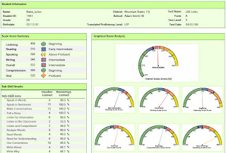
The CELA graphic more clearly allows the user to kick butt at what they do best, teaching. The portal display example encourages users to kick butt at toggling between documents or memorizing the goal area descriptions. Which would you rather have happen in your schools?
Here is a sample of simple excel graph that takes into account the fourth grand principle. It displays the scores in a simple way with the data table below. It completely integrates the visual and the data. The visual leaves something to be desired, so I have two more graphics to discuss.

The next two graphics are include a good example of the fourth principle and a poor example of the fourth principle. Both examples were the result of projects where I designed the visuals. The first example comes from a custom data analysis portal designed by Adams County School District 14 staff to analyze NWEA MAP data and the results of the Colorado Student Assessment Program (CSAP). The portal has been a smashing success with our targeted end users (teachers). We hear frequently how access to data in a convenient and user-friendly format has enabled teachers make decisions informed by student data. However, one complaint we have received is that where teachers can drill down to look at sub-scores for a test period the goal areas are not defined (see graphic below). It simply says, "goal 1". Users have to open a PDF document that translates the goal to language such as "number sense". Tufte artriculates that these words should be completely integrated and teachers should not be forced to open a new document and toggle between the two.

The graphic below displays the results for an individual student on the Colorado English Language Acquisition assessment (CELA). The test returns seven total scores and many sub-scores. A reader of this report knows instantly how a student performed overall and in each of the sub-areas. There is little question and absolutely no necessity to toggle to a key. The words, colors, and symbols clearly direct the reader to a usable description of student performance. See more examples of CELA reports here.

The CELA graphic more clearly allows the user to kick butt at what they do best, teaching. The portal display example encourages users to kick butt at toggling between documents or memorizing the goal area descriptions. Which would you rather have happen in your schools?
Wednesday, January 03, 2007
How Do We Improve Data Analysis Skill?
 It seems coming from education that we should have a rather simple answer to this question (it would likely include some rubric and self-assessment). The reality is that practice is the only sure way to improve analytic skill among administrators and teachers.
In grad school I would work feverishly to collect data, scrub the data, run descriptive and multivariate tests, and generate as many possible scatter plots as my Pentium I computer could handle. I would print my "results" and stare with black pen in hand to mark the compelling patterns. Without fail my advisor would come and join me for these analytic sessions. The story seemed the same every time: (1) he would set aside the statistical analysis suggesting that there was nothing to see there, (2) he would look at the patterns I identified (usually strong positive or negative correlations) and politely point out that there was nothing interesting in the auto correlations I observed, and (3) finally, he would draw odd shaped circles around groups of data on the scatter plots. These circles usually looked like amoebas, but definitely the patterns I had learned about in statistics class. He would then say, "I want to know more about these cases, try running this same relationship, but hold some variable constant." He found a compelling pattern on almost every printout. When I returned for more analysis I almost always found something complex, but compelling in the way he suggested I re-explore.
My advisor (Lewis Binford) never taught me to analyze data. He engage me and encouraged me to be curious. I learned by watching and practicing.
A culture of high-quality data analysis depends on leadership. It depends on high expectations for all members of the culture (teachers and administrators). Administrators must accept the mantle to be data analysis leaders. To be more prepared than their staff. Administrators need not come with the answers, but with the questions. Administrators need to nurture teachers and challenge them to be curious. Administrators should lead individuals to be kick-ass analysts, not simply facilitate the group to agreement on data analysis and cause.
Multiple Variable Visual Displays
The third Grand Principle from Edward Tufte is "Use Multiple Variables". As Tufte says, the world that we are trying to understand is multivariate. so our displays should be too. Tufte refers to the Napoleon March poster as a great example of the integration of multiple variables. In his example you have temperature over time, change in the size of the army, direction of movement, and time. It is an extraordinary display of the relationship between variables. Although I disagree with Tufte's assertion that this visual "Shows Causality", it clearly shows important and relevant relationships.
Teachers and administrators should accept the challenge to use multiple variables in their visuals during the exploration of achievement. This principle is espoused by many leaders in education (Schmoker, Love, Reeves, Stiggins, DuFour, and others) with Victoria Bernhardt being the most recognized champion for multiple measures. Bernhardt advocates for the exploration of the relationship between two or more of four dimensions that are important to school reform (student achievement, school processes, demographics, and perceptions of students, staff and parents). Bernhardt advocates for exploring the intersection of these dimensions to get at the root of a problem.
We are challenged to ask two-dimensional questions like, "what is the relationship between state assessment scores (student achievement) and grades (school processes)?" "Do students with positive attitudes toward school (student perceptions) perform better on the state assessment (student performance)?" Three-dimensional questions might include, "Do grades (school processes) have any relationship to state assessment performance (student achievement) for language learners compared to non-learners (demographics)?" What is key is that as teachers and adminstrators review these data they have access to appropriate visual displays of these data or know how to create usable charts. In addition, teachers and administrators must be compelled to ask the next question and manipulate the data.
Let's just take the first question, "what is the relationship between state assessment scores (student achievement) and grades (school processes)?" This crudely drawn diagram is similar to the relationship we found in our district for high school students. The relationship (shown in a scatter plot) is completely random and cannot be explained by any slope. By adding a third variable/dimension the graphic takes a dramatically different look. We can now see that those students that are not language learners have a positive relationship between grades and state assessment performance. In other words, for non-language learners grades appear to measure something similar to what is being measured on the state assessment.

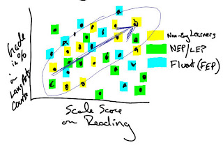
Although the visual display clearly reveals a pattern (one that is made-up), it does not tell me what causes this. However, it sparks a far deeper and more engaging discussion regarding grading and student performance when placed in three dimensions.
Show Causality?
The second grand principle that Edward Tufte espouses is to "show causality" in visuals. Tufte illustrates his point using a poster of Napolean's march in 1812. The poster shows multiple variables interacting and effectively links the military loss to temperature, not his opponents. As temperatures plummet the armies of Napolean are decimated. Tufte argues that this visual effectively shows causality.
For our purposes we need to contrast visuals used for argument and visual displays used for exploratory purposes. In data analysis for data-driven decision making the analyst is not “showing causality”, but instead wants a visual display of data that allows the data to talk back. Student achievement data (when arrayed with a comparative dataset) do not include causality, but are useful in describing reality. In analyzing student achievement data we are not juxtaposing data that result in cause, but rather looking for patterns. For example, a teacher might notice that all her students performed lower than average on vocabulary on the recent district benchmark assessment when compared to the rest of the students in the school. Nothing about that visual shows causality, but it is an elegant and appropriate display to begin exploring the reality of student performance. Thus, for exploratory data analysis “show causality” is not a necessary condition for a high-quality visual display.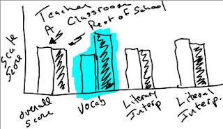
When teachers and administrators begin attributing cause for an observed pattern, Tufte’s principle of “showing cause” is a necessary condition for a high-quality visual.
Again, excuse my scribbles. They lack the design and attractiveness that i would prefer, but illustrate the point nonetheless.
For our purposes we need to contrast visuals used for argument and visual displays used for exploratory purposes. In data analysis for data-driven decision making the analyst is not “showing causality”, but instead wants a visual display of data that allows the data to talk back. Student achievement data (when arrayed with a comparative dataset) do not include causality, but are useful in describing reality. In analyzing student achievement data we are not juxtaposing data that result in cause, but rather looking for patterns. For example, a teacher might notice that all her students performed lower than average on vocabulary on the recent district benchmark assessment when compared to the rest of the students in the school. Nothing about that visual shows causality, but it is an elegant and appropriate display to begin exploring the reality of student performance. Thus, for exploratory data analysis “show causality” is not a necessary condition for a high-quality visual display.

When teachers and administrators begin attributing cause for an observed pattern, Tufte’s principle of “showing cause” is a necessary condition for a high-quality visual.
Again, excuse my scribbles. They lack the design and attractiveness that i would prefer, but illustrate the point nonetheless.
Tuesday, January 02, 2007
Enforce Comparison

Seven years ago I attended a seminar by Edward Tufte that described how to effectively display quantitative data. I recently ran across the notes from this seminar and was reminded of a few key points that are relevant to data in the K-12 setting. One of Tufte’s Grand Principles was that any data display must “enforce visual comparison”. In other words, we must always ask the question, “compared to what?”.
To “enforce comparison” be sure to: (1) select a relevant comparative dataset, (2) place the comparative data on the same graphic (or minimally on the same page), and (3) acknowledge the comparative data in the descriptive phase of any data dialogue.
The relevance of the comparative dataset can be measured on two-dimensional grid (crappy image drawn on tablet PC above--will work on photoshop soon) with relevance on the x-axis and the difficulty of acquiring the comparison on the y-axis. The ideal scenario is to obtain extremely relevant comparison without considerable effort. Highly relevant comparative data would be from schools are classrooms that are demographically similar. The most common occurrence is that we obtain comparative data that marginally relevant, but easy to obtain. For example, when we compare the performance of students within a school to all the other students nationally without taking into account demographic or longitudinal growth factors. Since highly relevant comparative are often difficult to obtain and can require some statistical or technical sophistication to distill, teachers are often reduced to using the less relevant data. This is not a total loss and should not be used to undermine the value of student performance data. Instead, teachers and administrators should ask for more relevant comparative data from central administration and test vendors. In addition, schools should work to create examples of highly relevant comparative datasets by comparing students and classrooms within the school.
Visual design is often overlooked in presenting student, school, or district achievement data. Data displays are often sloppy and fail to place comparative data that are necessary for analysis in proximity with the school data. It is important to place the comparative on the same graphic or minimally on the same page.
High quality fact-based statements about student data of any kind reference comparative datasets. Avoid simply saying, “3rd grade students scored 65% proficient or above on the CSAP in 2006.” Even saying, “3rd grade students scored 65% proficient or above on the CSAP in 2006, which is a 4% improvement from 2005” is unsatisfactory because the 2005 data are not necessarily a relevant comparative dataset (different students in a different year). On the other hand, saying “3rd grade students at Betcher Elementary school score 25 scale score points higher on vocabulary than demographically similar students from across the district” makes a statement of performance relative to a relevant comparative dataset.
While Tufte is focused on effective use of visual display to convey a message (make a causal statement), his principle of Enforce Comparison is extremely relevant as a basic starting point for educators engaged in data-driven decision making.
Subscribe to:
Posts (Atom)